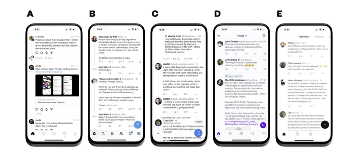
Keep scrolling. And scrolling. And scrolling. The stream is full of word-filled posts—posts with options to like, comment and repost/quote. These written posts can be expanded upon… into threads.
Newly-released social media app Threads has the aesthetics of Instagram and the functionality of X. There’s new blood drawn in the infamous rivalry between tech tycoons Mark Zuckerberg and Elon Musk. On July 5, 2023, Zuckerberg’s Meta launched Threads, directly aimed toward Musk’s X.
Threads logged 100 million registers within five days. The revolutionary ChatGPT took two months to achieve that feat once it launched in November 2022.
And ChatGPT is considerably a new concept introduced to the general public, which supposedly had expectations of exponential growth. Its introduction to AI was supposedly a new innovation.
Instead, Threads is just X’s twin sister who is obsessed with bubbly Instagram.
That reduces ChatGPT to the in-law of the aristocratic family.
As compared with X’s performance, Threads has a higher demand starting with its introduction as opposed to X. However, that may also be attributed to Meta’s decision to create an account connected to their Instagram account, especially since the amount of Instagram users is monumental compared to X.
Threads follows a very formulaic path towards its design, a mechanism that is supposed to welcome creativity among social media apps. Its navigation bar consists of a home screen serving as the stream (where various recommendations appear), a search tab, a post option, a forum for tracking activity (e.g. likes, comments, follows, etc.) and an accounts page. The character limit of 500 is an obvious derivative of X’s 280-character limit. This format is very similar to many other text-based social media apps, not exclusive to just X, with similar features and unoriginal design.
The replication of Threads isn’t a feat entirely new among photo-based, video-based and messaging-based social media apps. Case A: In August of 2016, Instagram released its “Stories,” feature- a direct clone (and one bearing the same name) as Snapchat’s popular “Stories” feature. Soon after, apps like Facebook and WhatsApp (to just name a few) adopted their own version of Snapchat’s “Stories.”
Case B: 2020 technology and TikTok. TikTok’s astronomical success is representative of how its short, bite-sized media matches dwindling user attention spans. Never ones to be left out, other apps were eager to capitalize; Instagram launched “Reels,” and YouTube followed up with “Shorts.” These are just two examples of how a wide range of social media apps have opted to recycle basic formats. Industry-wide, creative design is in dreadful decline- minimalistic features amongst previously diverse social media apps is in.
Beyond these replications, the uniform design unfortunately disappoints. UX design is standard across these apps, and UI design simply plays a game of color theory. In recent years, tech developers have submitted a skeuomorphic design in designing these apps. Skeuomorphic designs reflect real-life objects, but the tradeoff is minimalistic UX design at most. Instagram’s new logo is a prime example. A bubble of words resembles text and the literal image of a camera reinforces Instagram’s main purpose as a photo sharing and taking app. With a modern trend for simplicity and specifically rounded edges, boxes and parameters in these social media apps all follow the same style as well. Ironically, where technology should have complexified, popularizing skeuomorphic design has made the progress of design paradoxical; everything looks rather basic and simplistic.
In this billionaire’s game, these major social media companies attempt to oust each other by developing “new” apps. In a way, we, as the clients, are mere pawns in big tech’s struggle to create something new by launching the newest, most innovative app. For the over 100 million users who have Threads, it is “new tech,” too, as evidenced by the immediate downloads of the app. Still, consumers share some of the culpability. Developers are centered around consumer reaction and the public often fuels the creation obsession.
However, hype eventually dies down, as seen with Threads’ slow increase in new users. The theme is quite obvious—each new app that is marketed fuels the viral reception among social media users yet loses popularity once it begins to age.
It is quite unfortunate to see that these developers have yet to conceive a completely fresh new form of technological media, instead opting for a recycled approach of what they know sells. With ChatGPT’s “assistance,” the diversity of design should be endless. Perhaps it’ll just take a few more ChatGPT trials to mark the “discovery” of another technological era.


